Case Study 04 · 2025
Lux Med — Visit History
UX case study and live prototype — search visit history by doctor or specialisation in the Lux Med patient portal.
Interactive prototype
Open live demo — try it in your browser
lux-med-eta.vercel.app
Project overview
What this project was
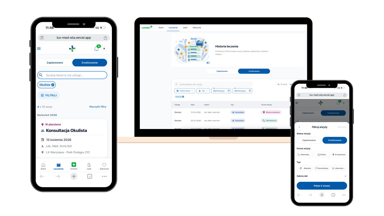
As a Lux Med patient, I found visit history hard to search when I remembered the doctor or specialisation but not the date. I interviewed five other patients, reviewed the current UI in my own portal, and built a live prototype with search, filters, and a scannable table. This is not a visual rebrand — it focuses on helping patients find past visits faster.
User goals
Let patients find a past visit by doctor or specialisation, review history quickly, and narrow long lists with filters — on desktop and mobile.
Why it mattered
Patients often remember who they saw, not the exact date. Without search by doctor or specialisation, they scroll the card list — even though date filtering is available. That gap matters most for people with longer medical histories.
The problem
Where it was breaking
User pain points
- No search by doctor or specialisation — the way patients most often remember a visit (date filtering exists).
- Long card lists mean more scrolling as histories grow.
- Hard to compare visits at a glance on the card layout.
- Different visit types and details look similar on each card — easy to miss what you need.
Business challenges & constraints
- Keep the screen easy for patients who visit rarely, but add search and filters for those with long histories.
- Show different visit types — specialist, lab, imaging, teleconsultation — without overcrowding the list.
- On mobile, put filters in a bottom sheet so the visit list stays readable and easy to use with one hand.
- “Before” screens come from my own Lux Med patient account — for analysis only, not an official audit.
- The new table view adds to the current card layout; it does not replace it entirely.
My role
What I owned
Research & discovery
How I learned what mattered
- 01
Personal experience
As a Lux Med patient, I could not find a past visit by doctor or specialisation — only scroll through cards.
- 02
User research
Five interviews with current Lux Med patients confirmed the same gap: no quick lookup by doctor or specialisation.
- 03
Analysis
In my own portal, date filtering exists — but not search by doctor or specialisation, which is how patients most often try to find a visit.
- 04
Structure & design
Designed a search input, scannable table columns, and filters for status, type, format, and date range.
- 05
Frontend build
Built and deployed a live prototype with working search, filter state, responsive table, and mobile bottom sheet.
Challenges
Technical & UX hurdles
Readable table layout
Six columns of medical data had to stay scannable without feeling like a spreadsheet.
Search and filters together
Instant search by doctor or specialisation, plus filters for status, type, format, and date — clear roles, no overlap.
Mobile filter UX
Bottom sheet, chips, reset, and apply — active filters visible without crowding the visit list.
Current experience
How visit history works today
Screenshots from my own Lux Med patient portal — the starting point for this concept.
The solution
My proposed improvement
Search by doctor or specialisation
A search input at the top — type a doctor’s name or specialisation to narrow results without scrolling every card.
Table view for desktop
An additional table — date, service, doctor, visit format, status, and type — to scan and compare results quickly.
Structured filters
Filter by status, type, visit format, and date range — combined with search when users need to narrow further.
Mobile filters
Search stays visible; filters open in a bottom sheet with chips, reset, and a sticky “Show results” button.
Screens
Proposed mobile filtering flow
Results & impact
What this concept aims to improve
A concept for faster visit lookup: search by doctor or specialisation, less scrolling, easier comparison across visits, and consistent filtering on desktop and mobile.
Key learnings
What I'm taking forward
Lesson 01
Better structure often matters more than new features — organising visit data made the biggest difference.
Lesson 02
Desktop needs a scannable table; mobile needs a compact filter flow — not a shrunken desktop layout.
Lesson 03
Search by doctor or specialisation matches how patients actually remember visits.
Lesson 04
Building a live prototype revealed real trade-offs early — especially how search and filters share space on mobile.