Case Study 01 · 2024
Verify Bank Account
UX & frontend redesign of a bank account verification flow inside an existing financial platform — fewer errors, higher completion, lighter support load.
Project overview
What this project was
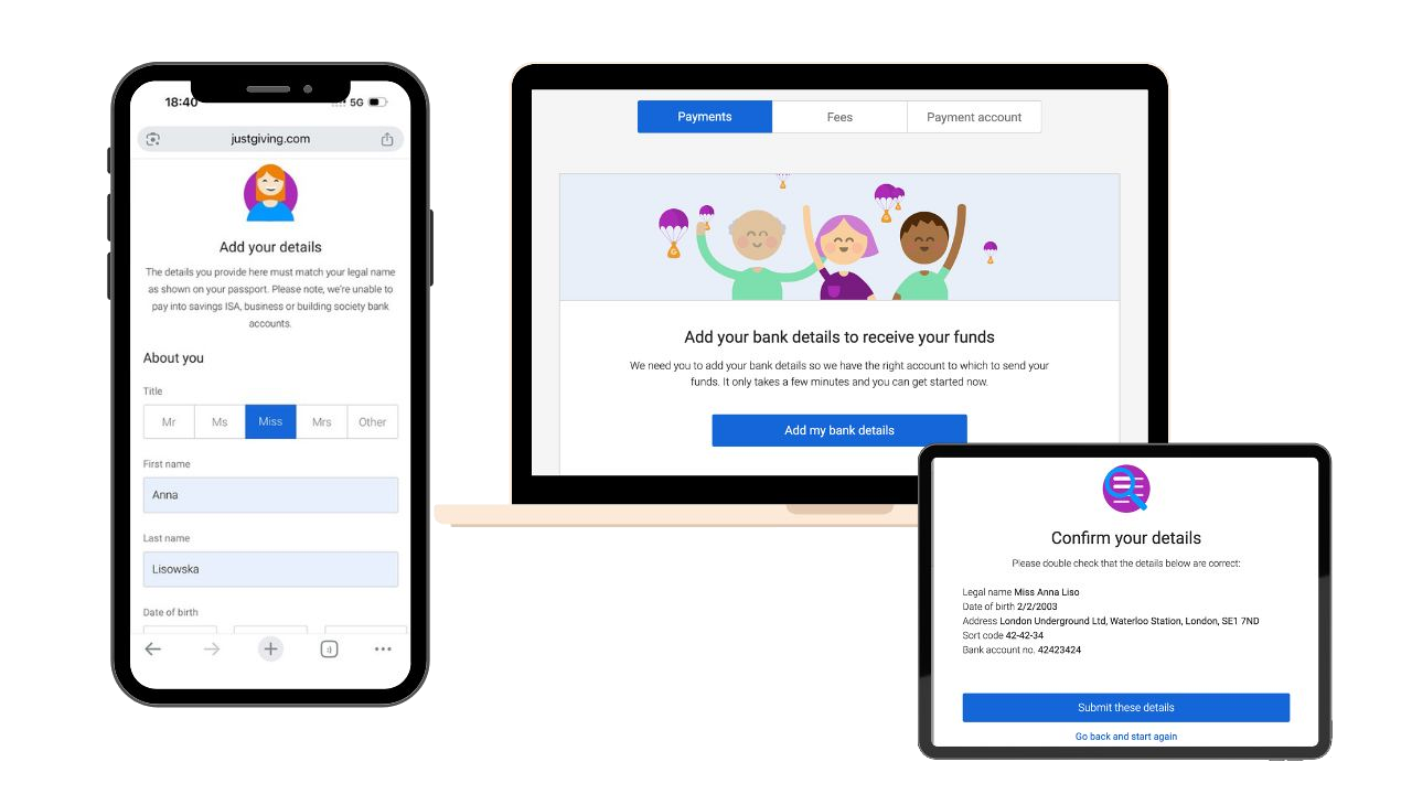
I led the UX and frontend improvements for the Verify Bank Account feature inside an existing financial platform. The goal was to reduce user confusion, improve completion rates and decrease the volume of support requests tied to account verification.
Business goal
Lift verification completion and compliance rates while reducing the support load caused by avoidable user errors — all within an existing product and tech stack.
Why it mattered
Failed verifications blocked customers from receiving funds and were one of the top drivers of inbound support contacts. Every recovered user meant faster payouts and lower operational cost.
The problem
Where it was breaking
User pain points
- Feedback appeared only after submit — users clicked through the whole form before learning a field was wrong.
- Error messages were generic and unhelpful — they rarely explained what to fix or how to recover.
- There was no inline validation while typing, so mistakes surfaced late instead of as users filled in each field.
- Address lookup failures had no clear recovery path when postcode search did not work.
- Underage and edge-case users hit hard error screens with no obvious next step.
- Many users abandoned verification before reaching confirmation.
Business challenges & constraints
- Feature lived inside an existing system — no full redesign possible.
- Strict compliance: only personal UK bank accounts (no savings, ISA, business or building society).
- Legal name had to match passport / bank statement exactly.
- Growing pressure on customer support from verification-related tickets.
My role
What I owned
Research & discovery
How I learned what mattered
- 01
Discovery
Interviewed the customer support team and reviewed recurring verification tickets to identify the highest-impact failure points.
- 02
Audit
Walked through the live flow end-to-end, documenting every error state, copy issue and constraint imposed by the existing system.
- 03
Definition
Mapped a single-column journey with clear field grouping: identity → address → bank details → confirmation.
- 04
Design & Build
Designed and implemented the redesigned screens with inline validation and shipped them iteratively behind the existing platform.
Challenges
Technical & UX hurdles
Working within an existing system
Components, layout grid and validation pipeline were inherited. Improvements had to slot into existing patterns rather than replace them.
Late, server-side validation
Errors were originally surfaced only after submit. Added client-side rules and field-level checks to give users instant feedback.
Strict legal & compliance rules
Legal name, age and account-type rules had to be enforced clearly without scaring users — copy and timing of errors mattered as much as logic.
Address lookup edge cases
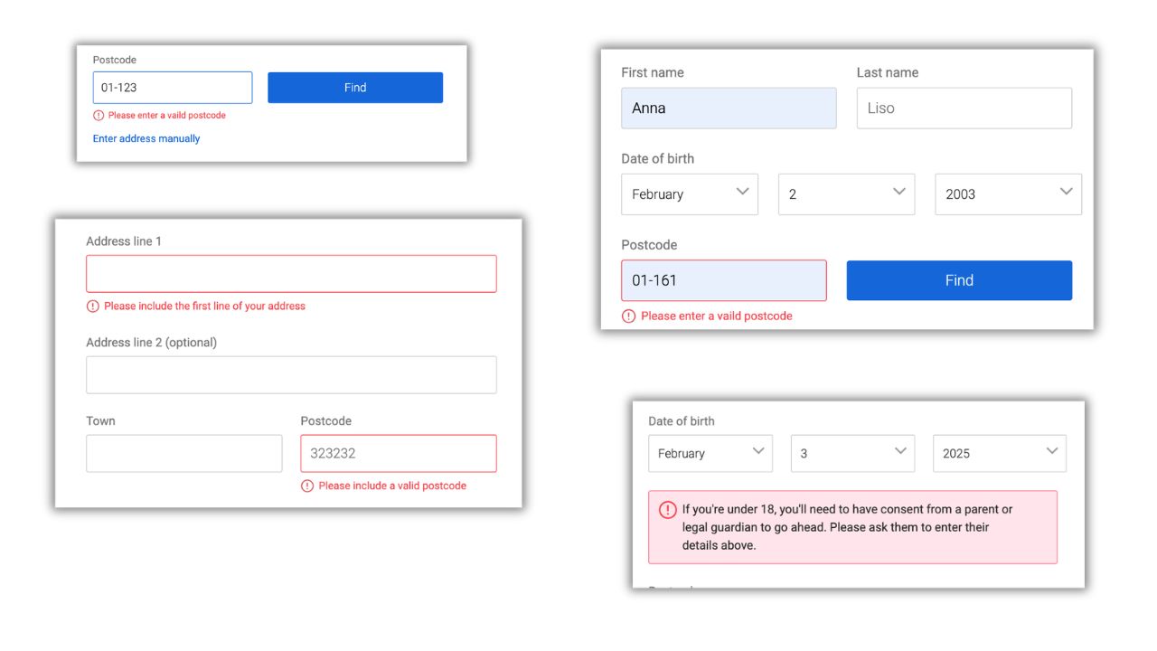
Postcode lookup could fail silently. Added a visible "Enter address manually" fallback so users were never stuck.
Error handling
When something goes wrong, users still know what to do
The old flow surfaced problems after submit. The redesign shows errors next to the field as users type — so messages like postcode validation are immediate guidance, not a late surprise.
The solution
What I designed & shipped
Clean single-column layout
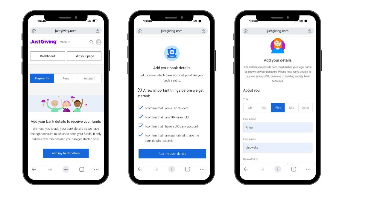
Reorganised the flow into a single-column structure with clear visual hierarchy.
Logical grouping of fields
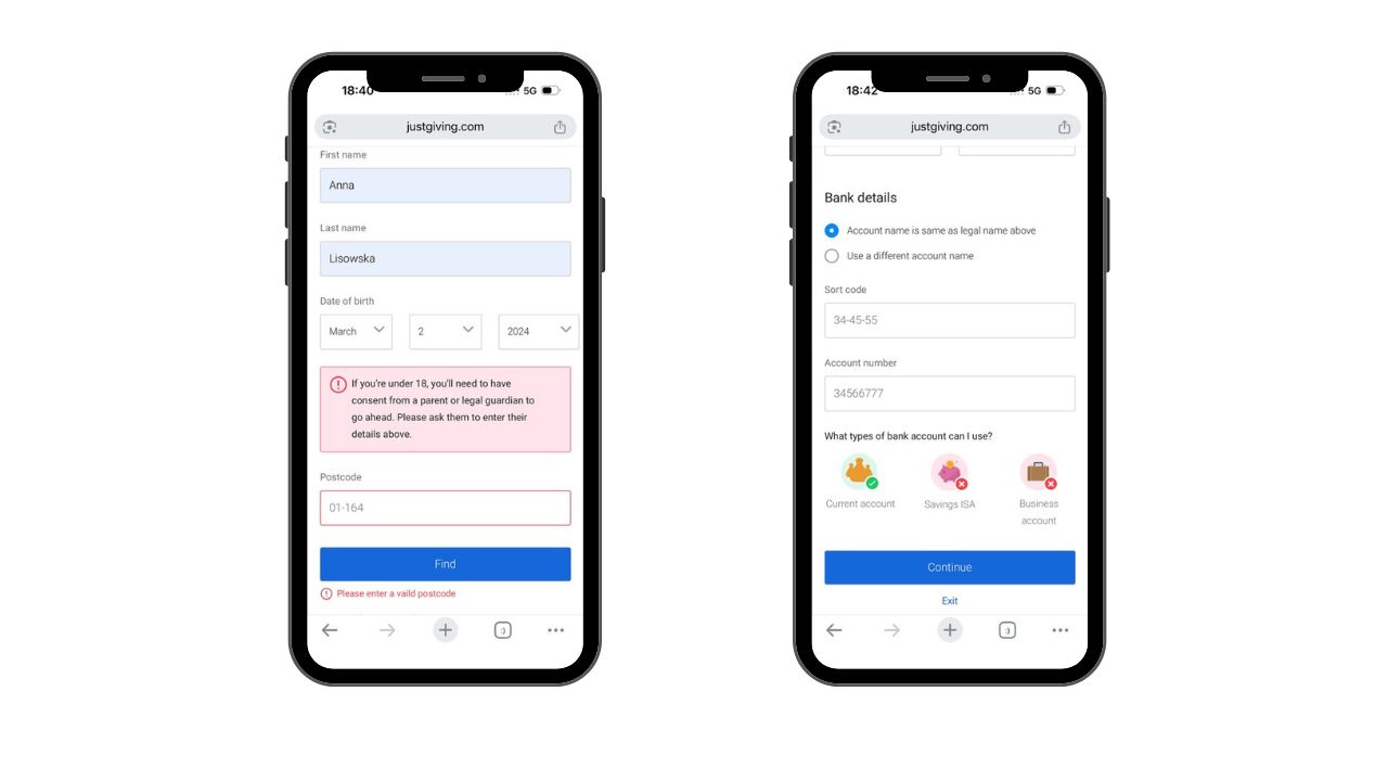
Grouped related fields (About you, Address, Bank details) so each step felt focused and predictable.
Clearer labels & instructions
Rewrote labels and helper text in plain language — explaining why information is needed (e.g. legal name must match the bank statement).
Inline real-time validation
Validated first name, last name, date of birth and postcode as the user typed, with friendly recovery hints next to the field.
Immediate, human error messages
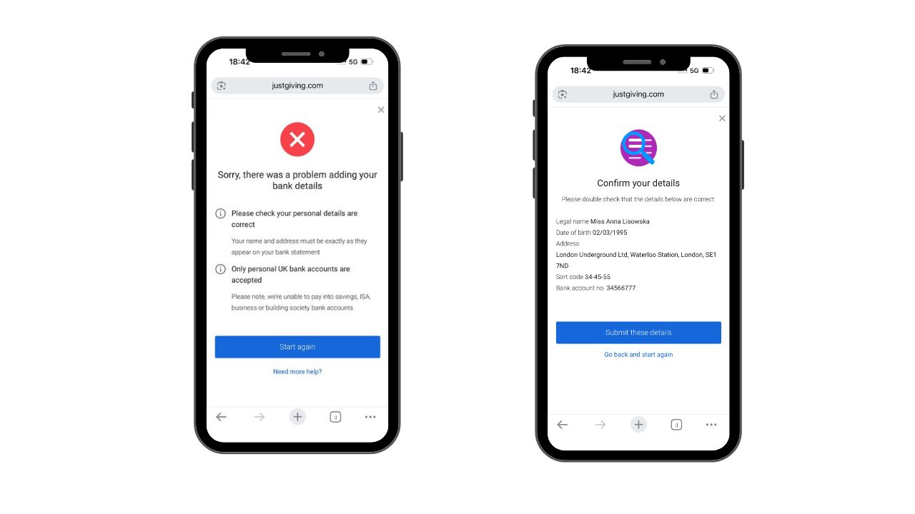
Replaced vague, post-submit errors with specific, field-level copy — length and format hints next to the input, age/consent warnings in context, and a clear path when bank details could not be added.
Confirm-your-details review step
Added an explicit confirmation modal summarising legal name, DOB, address, sort code and account number before submission — catching mistakes before they hit the bank.
In action
Verify Bank Account — feature walkthrough
A short walkthrough of the feature as shipped — the same flow described in this case study.
Results & impact
What changed after launch
-24%
Verification-related support tickets
01+12%
Flow completion rate
02Key learnings
What I'm taking forward
Lesson 01
Inside hard compliance constraints, copy and validation timing are the biggest UX levers.
Lesson 02
Customer support is the fastest source of qualitative research — their tickets are a backlog of UX bugs.
Lesson 03
Inline, plain-language errors reduce anxiety far more than visual polish.
Lesson 04
A simple confirmation step prevents a surprising share of downstream failures and support tickets.